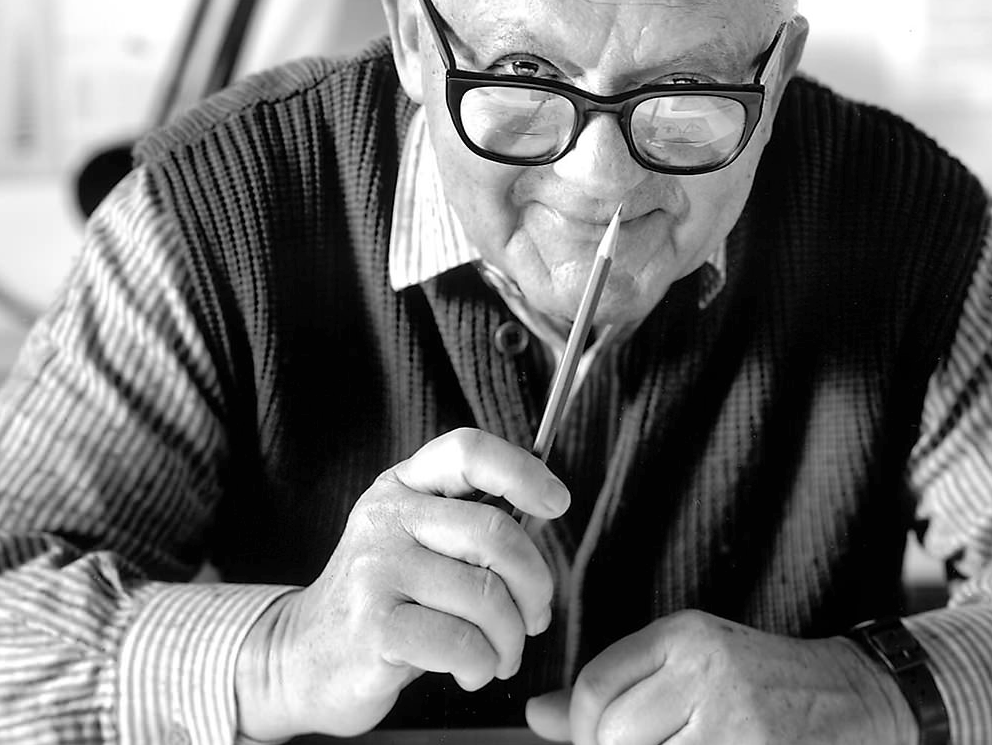
Early Life:
On the 15th of August 1914, Paul Rand was born into a Jewish family in Brooklyn, only his name wasn’t ‘Paul Rand’ at this point in his life, his name was ‘Peretz Rosenbaum’. Later he decides to change his name for the sake of his career. Rand’s family followed Orthodox Jewish law, which means they were prohibited from making images. So from the beginning, becoming a designer or artist was an uphill struggle for Rand, as he was going to have to break the rules of his household. Creativity was in Rand’s blood and although his family’s religious values did not condone his dreams of becoming a designer, Rand would paint signs for his father’s grocery store and for school events. As expected of his Jewish father, he didn’t believe that art was going to provide him with a living, so he warned him about chasing his dream of becoming a designer. However his father didn’t forbid it, he allowed him to attend night classes at the Pratt institute. Rand learned next to nothing there, anything that he did learn during this time was from self-teaching. Rand would spend time in bookshops studying european magazines and books such as ‘Commercial Art’ and ‘Gebrauchsgrafik’, these two books introduced him to graphic design and Bauhaus-ideas.
Soon after teaching himself the basics of design, Rand began to venture out into the professional world and his career began with humble assignments. Working in a part-time position creating stock graphics for an agency who were suppliers for various newspapers and magazines. When he wasn't working on assignments in his part time job, Rand would be working on his own side projects and began building a large portfolio.
This was around the time he decided to get rid of his strong Jewish identity ‘Peretz Rosenbaum’. Rand felt that his Jewish name may hinder success in his career. Abbreviating ‘Peretz’ to ‘Paul’, taking the surname ‘Rand’ from his uncle, he created a new identity ‘Paul Rand’. It was said by Morris Wyszogrod, a friend of Rand’s, that what influenced his name was he thought:
“four letters here, and four letters there, would create a nice symbol.”
Rand now had lost his Jewish identity, breaking down another barrier towards huge success.
Careers:
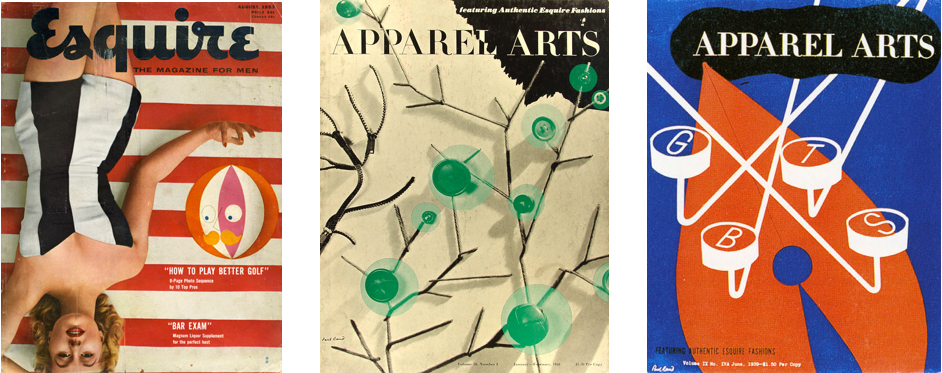
With a new name and portfolio, he landed himself a job in laying out an anniversary issue for a men’s fashion magazine ‘Apparel Arts’, published by ‘Esquire’. Rand had a remarkable talent, he could transform mundane photographs into dynamic compositions, this talent earned him a full time position at Esquire. Rand was far from mainstream and did not have a distinctive look at the time, but his witty collages and humourously cropped photographs were unlike anything that was being published at the time.
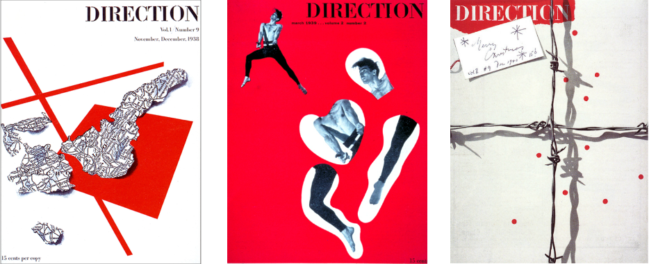
During his time working for Esquire Rand took on some more freelance work, designing for ‘Directions’ which was a cultural magazine. Rand wanted freedom to do what he wanted with his artwork and designs, so he did the work charging no fee and in return he received full artistic freedom. Money wasn't Rand’s goal at this time. Creating designs with his name at the forefront, getting his name and style out into the world was. The first cover that he created for Directions was symbolising Nazi Germany’s dismemberment of Czechoslovakia. It consisted of a cutout of a Czechoslovakian map, against a white background, it was lit so that the shadows gave a three-dimensional effect. Two intersecting bars separate the map which suggest the lines of German annexation. Rand downplayed the originality of his ideas, saying that they were influenced by Picasso and surrealism. Despite this, these Direction covers were milestones in the development in Rand's designs.
Rand’s work in advertising was different from most other designers, he would often use the most functional ‘sans-serif’ and ‘serif’ fonts and combined these with his own hand writing to save money. Using his own hand writing contributed to the friendliness of his work. He made his designs appear simple but very intellectual, making them stand out from typical ads around that time. Rand had the ability to use easy to understand layouts which where both artistic and easily conveyed the desired message, so that anyone who happened to see it would understand what the company was trying to sell. No two designs were the same as each new project had it's own problem with a different solution. Rand would define the problems and create his own solution with no mainstream influences. This led to creating ads that where eye-catching and visually smart, every detail in his designs had a purpose.
Towards the end of his time at Esquire, William Weintraub, a senior at Esquire, sold all his shares and left the company. This proved to be the next door to open to Rand, as William started his own advertising office. Offering Rand the position as chief art-director at the new agency, that was enough for Rand to end the three years he had spent at Esquire.
Rand was not an art-director in the traditional sense, he brought about the ideas and most of the artwork himself and admits he rarely delegated. Most of the staff at Willaim’s new agency where only there to serve Rand’s creatives needs, according to his strict requirements. The staff were afraid of Rand, he would say no to work if he was unsatisfied, if it was “really lousy” he would simply tear it up. Rand was harsh and often at times rude, he didn’t have patience for long discussions with people who questioned his authority. However Rand would not just simply say no to the work and leave it at that, he would take time to digest the situation, come back with answers, designs and ideas on how to fix the problem that they were facing. Rand was known to be a good teacher but just not a pleasant one.
In Europe signing ads was common amongst designers and was a way of getting recognition for your work. In America it was not so common to see signatures on work that was produced in an agency, designers were subordinate to the overall identity of the agency. However Rand’s position in Weintraub’s was unusual as he would sign his work, despite the fact he was working for an agency. Signing his work was just another way he was getting recognition and publicised. Rand’s name and style was becoming more and more popular, so popular that his work could be identified without a signature. By the late 1940’s Rand felt his name was now worth more than what he was getting from Weintraub, so he demanded that they doubled his pay for half the time. Rand's demand was accepted.
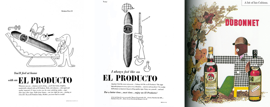
Rand's work often contained sketchy drawings with visual puns, this style at the time was unique and alluring. The “El producto” , Coronet or Dubonnet ads were a typical example of his way of working. The products he produced were not mainstream but that never compromised them being published. He would develop a logo which would be seen as an icon. Logos normally were just put at the base of an advertisement, but this was not the case with Rand’s work. The logo would become a potential illustrative feature, a character.
Corporate Identity:
It was said by design veteran Louis Danziger:
“Anyone designing in the 1950s and 1960s owed much to Rand, who largely made it possible for us to work. He, more than anyone else, made the profession reputable. We went from being commercial artists to being graphic designers largely on his merits.”
Paul Rand is responsible for almost singlehandedly convincing business that design was an effective tool. Many of the corporate logos that Rand designed are the main reasons he stands out as a designer. Some of the companies that Rand designed for are ABC, Cummins Engine, Ford, UPS, NeXT and IBM which still use the logo he designed.
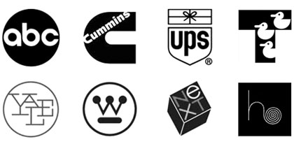
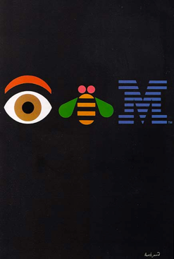
IBM began in 1888, but after the second world war other multi-national corporations where springing up, it was at this time that Rand decided that he would clean up the logo of IBM. Rand created the IMB logo over 50 years ago and over time he modified it twice. Coming with small ideas to the corporation each time so that they would be accepted. IBM is a very conservative organisation and he knew that too much change and his ideas would be rejected. So the logo had to go through stages to get it to the design he wanted, this took over 10 years but the final outcome was a timeless piece of work and worth the wait. It was simplistic and stood the test of time, this logo was created in 1972 and over 40 years later you will see the logo still in use in 2015. Rand also designed the packaging and marketing materials for IBM from the early 1970’s, then in 1981 Rand created the IBM poster which consisted of images to represent letters. Rand used an eye and a bee then using the M from the logo that he had designed. This is one of the most memorable pieces of work that Paul Rand stands out for.
Rand's work can sometimes comes across as simplistic, because it is. It has been designed to look that way so that it can be understood by everyone. However the process of getting these simplistic logos is not so simple. Rand could do one sketch and solve a problem in an instant but he could do 50 sketches of the same logo making slight adjustments. Rand’s years of experience and skills meant he would normally fix the problem in one attempt. This was the case when it came to creating the logo for UPS. It was 1961 and Rand was challenged with transforming an out-of-date logo of a shield into a modern image. Rand simplified the logo, he placed a package onto the shield and used lower case letters. “I didn’t try anything else” Rand admitted. He believed that showing more than two ideas weakened your position. UPS had called a meeting with Rand for him to pitch his ideas and present the work he had done. Rand came into the meeting and didn't even take off his coat. All he brought was one sheet with the logo that he had created. This was not arrogance, it was what he believed to be the best logo, so he why would he show anything else if he didn't believe in it? UPS agreed to use his logo and it remained their logo for over 40 years, until March 2003.
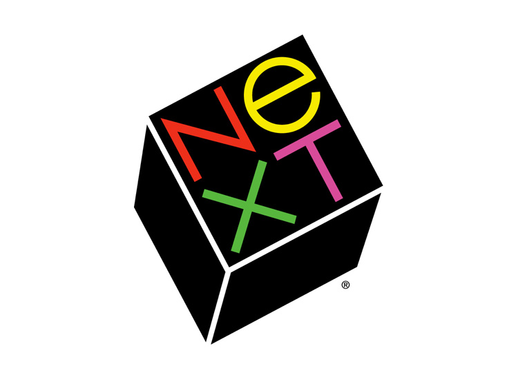
Another milestone in Rand's life was working with Steve Jobs on the ‘NeXT’ logo. Steve jobs states:
“I asked him if he would come up with a few options, and he said, ‘No, I will solve your problem for you and you will pay me. You don’t have to use the solution. If you want options go talk to other people.’”
This was what Rand did, he solved the problem by creating a logo that was a symbol but also consisted of the company name within it. The reason for this was so it would not take years of this icon being seen to associate it with the company.
In the end, Paul Rand changed the graphic design profession forever. He created a link between European modern art and American commercial art. Rand was gutsy and bold throughout his career, coming through from a family where his dreams where against their beliefs, changing his name rather than take the chance that it may have hindered his success in his career. Rand had courage that allowed him to break through barriers and traditions, enabling him to be himself and produce work that he believed in. His impact as a designer and philosopher has left its mark. It was in November 26th 1996 when at the age of 82 he passed away, but will always be remembered as an iconic leader in the field of graphic design.